Trader Voices
Why Smart Traders Choose Stolo?
Every trade is a small bet on a dream, backed by risk and a decision you have to own. Stolo is built for traders who bring purpose and discipline to that decision, not just numbers.
Know exactly where the market stands the moment you open it. Stolo's NSE market heatmap shows every F&O stock, sector by sector, colour-coded by move intensity.
No credit card required · Trial Plan available · Setup in 3 minutes

When the market opens, you have minutes to form a view. Most traders spend those minutes flipping between tabs, missing the sectors that are moving and the stocks that matter.
Watching individual tickers gives you fragments. You never see whether the move you're tracking is isolated or part of a sector-wide trend.
NSE has hundreds of F&O stocks. Scanning them one by one before market hours just isn't practical, so most traders give up and trade on instinct instead.
The market rarely moves as one block. Banking could be selling off while IT rallies. Without a sector-level view, that rotation stays invisible until it's too late to act on it.
A 0.5% NIFTY gain could be two large-caps dragging the index up while 80% of stocks are actually falling. Standard indices hide that reality completely.
By the time you piece together a directional view from scattered data, the opportunity has already moved. It's structured context that makes first movers, not faster reflexes.
A market heatmap is a visual representation of the entire stock market where every instrument shows up as a colour-coded tile. Green means gains, red means losses, and the intensity of that colour reflects the size of the move for the session, giving you a structured, at-a-glance read on market breadth.
Instead of reading numbers in a list, you read the market visually: deep green tiles are strong movers, pale green is mild, pale red is a modest dip, deep red signals real selling pressure. Arranged by sector, the heatmap surfaces patterns, which segments are leading and which are lagging, that a traditional watchlist simply can't show you.
Explore More Market Analysis ToolsEach tile's shade reflects the size of the move. A stock up 3% shows a different shade than one up 0.3%, because the intensity is data, not decoration.
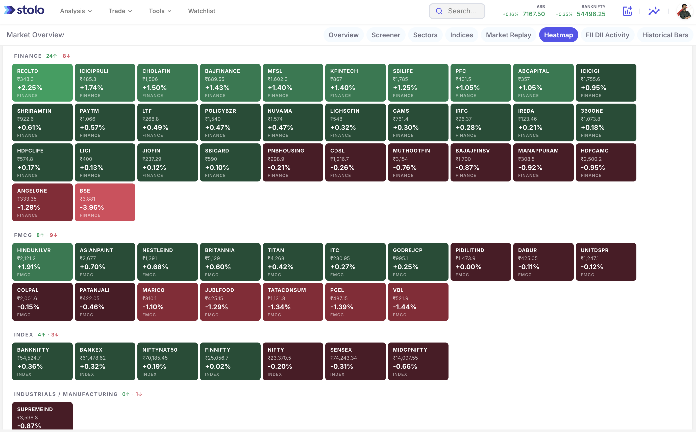
Stocks sit grouped under their sectors, Banking, IT, Pharma, Metals, and more, so you can tell right away whether a move is sector-driven or just one stock doing its own thing.
Count the green tiles against the red ones across the full heatmap and you get a real measure of market breadth: how many stocks are actually taking part in a rally or a decline, not just the headline index number.
The heatmap is your starting point, not your endpoint. Spot an interesting tile, click through, and open a full instrument-level analysis without leaving your workflow.
The Stolo market heatmap pulls every NSE F&O stock and index into a single, live, sector-sorted visual, so you land on a market view in seconds instead of minutes.
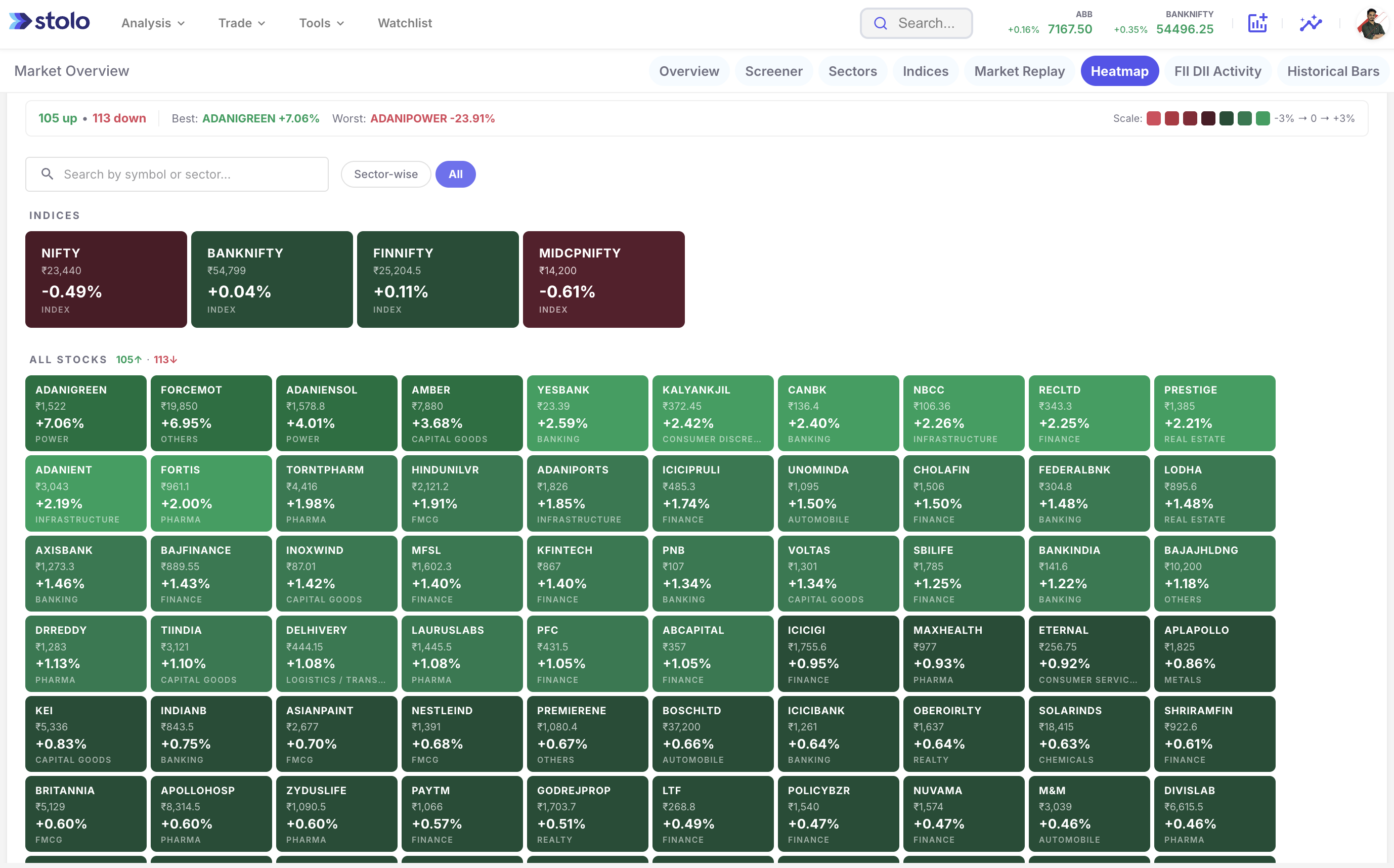
The default view loads the entire NSE F&O universe sorted by sector. NIFTY, BANKNIFTY, FINNIFTY, and MIDCPNIFTY sit as index tiles at the top, followed by every instrument in its sector block. Open it, and you already know where the market stands.
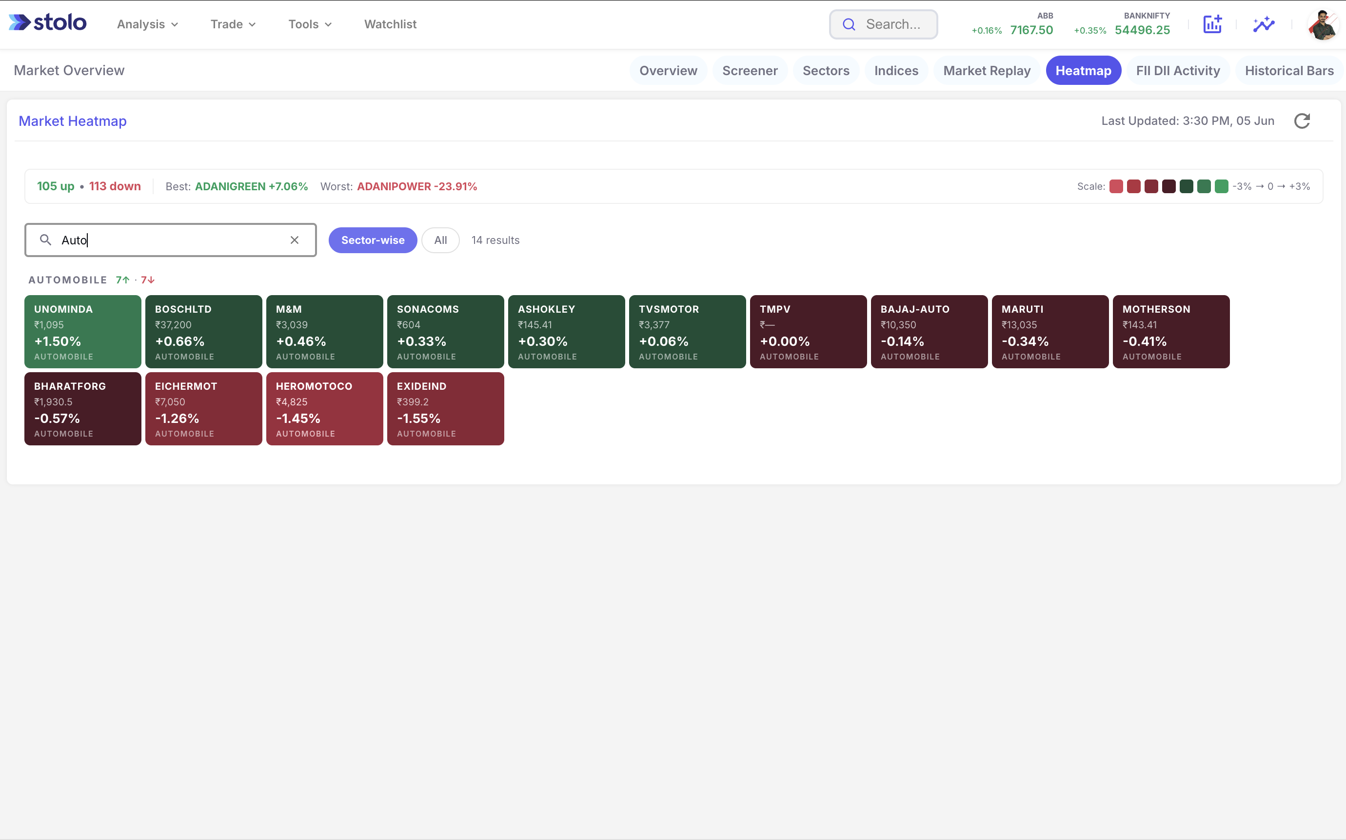
Spot a sector that looks interesting on the full view, apply the sector filter, and the heatmap narrows to just those stocks. Banking, IT, Pharma, Metals, Oil & Gas: filter by any of the 20+ sectors supported and get a clean, undistracted view of every instrument in it.
NIFTY, BANKNIFTY, FINNIFTY, and MIDCPNIFTY sit as prominent tiles at the top of every heatmap view. Their colour and size tell you the broad market direction before you've looked at a single stock tile below. BANKNIFTY deep red while NIFTY sits pale green? That divergence alone should shape your whole session view.
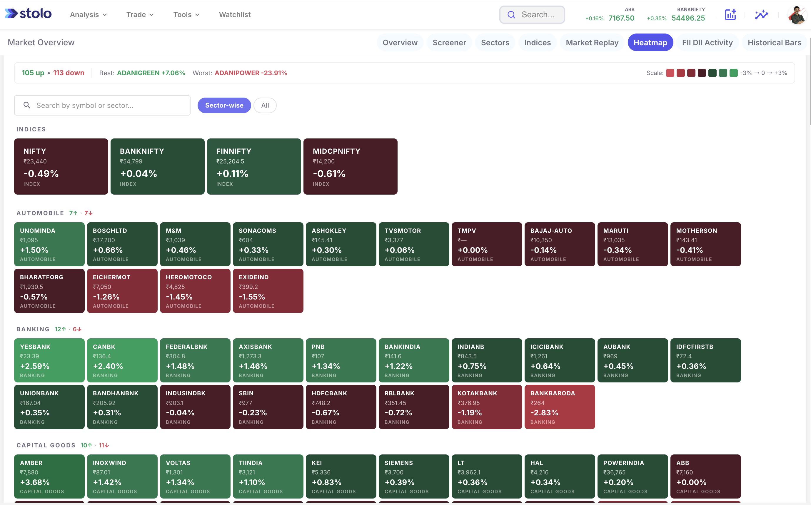
An on-screen colour scale legend maps each shade to a specific percentage range, from deep red at significant losses, through neutral, to deep green at strong gains. There's no guessing involved: a tile's shade tells you whether the stock is up 0.5% or up 3%, no need to read a number at all.
The heatmap is a starting point for deeper analysis, not a dead end. A tile catches your attention, an outsized mover, an odd pattern within a sector, and you can jump straight to that instrument's options chain, OI analysis, or price chart without losing the market-level context you built up first.
The heatmap communicates market conditions visually. Here are the four primary states a trader needs to recognise and act on.
Most tiles across multiple sectors green with moderate-to-strong intensity means the rally is broad-based. That's a healthy market where institutional money is rotating across segments rather than piling into one name. Bullish setups tend to have a better follow-through rate in sessions like this.
Deep red across Banking, IT, Metals, and other major sectors at the same time points to a coordinated selloff, usually driven by macro news, global cues, or FII outflows. Bottom-fishing carries the most risk in these sessions, so caution should outweigh aggression.
Some sectors strongly green while others sit red is sector rotation in action, capital leaving one segment for another. The heatmap surfaces this in seconds: Banking deep red, IT deep green, and you're watching smart money reposition in real time. Trade the sectors gaining ground, not the ones losing it.
Nearly every tile pale, small moves in either direction, and the market's in a consolidation or indecision phase. Volume usually thins out and premiums deflate. These sessions suit theta-based strategies better than directional bets, and the heatmap flags this condition before you've placed a single trade.
Professional traders don't open positions without a market view first. The heatmap gets you that view in under sixty seconds, provided you run the same process every session.
Start 7-Day TrialUse the pre-market window or the early session minutes, when the heatmap is reflecting global cues, to form your bias. The colour distribution before 9:30 AM tends to map closely to how the first hour unfolds. Most retail traders skip this step, and starting with context is exactly the edge they're giving up.
NIFTY, BANKNIFTY, FINNIFTY, and MIDCPNIFTY sit at the top of the heatmap. Check their colours and percentage values before anything else. NIFTY green and BANKNIFTY red is a divergence worth digging into before you even glance at individual stocks.
With the default view up, let your eye find the clusters: which sectors are uniformly green, which are uniformly red, which are mixed. A sector that's one solid colour is the heatmap telling you the move is sector-driven, not one large-cap dragging the index around on its own.
Found a promising sector? Apply the sector filter to isolate it. You'll now see exactly which stocks within that sector are leading the move and which are dragging behind, a distinction that matters a lot once you're picking a specific stock within a sector trend.
Look for tiles with extreme intensity: dark green sitting in a mixed sector, or dark red in an otherwise bullish one. These outliers usually mean a stock has a specific catalyst behind it (results, news, a block deal), and can be strong setups when the broader market context lines up.
Click through on your candidate stock and land on its options chain, OI buildup, or price chart on Stolo. By the time you're looking at the instrument itself, you've already got sector context, breadth context, and index direction stacked up, three layers of information most traders never have all at once.
Both tools help you find opportunities, but they operate at fundamentally different levels of abstraction. Understanding when to use each one sharpens your process.
The heatmap shows you the entire market at once, in colour. Its value is breadth and instant sector-level pattern recognition: you see everything before you zoom in on anything specific.
A screener filters stocks against criteria you set: OI buildup, volume surge, RSI range. Its value is precision, finding candidates that match exact conditions, but only if you already know what you're looking for going in.
The Stolo workflow: Start with the market heatmap to see what sectors and conditions are active today, then bring in the screener to pinpoint the exact stocks worth trading within those conditions.
See It in ActionNot every heatmap is built the same. See how Stolo compares to the alternatives most traders currently rely on.
| Feature | Stolo | NSE Website | MoneyControl | Broker Platforms |
|---|---|---|---|---|
| Full F&O stock heatmap | Limited | |||
| Sector-level grouping and filter | Partial | |||
| Index tiles (NIFTY, BANKNIFTY, FINNIFTY, MIDCPNIFTY) | Separate pages | Partial | Partial | |
| Colour intensity scale with percentage bands | Basic | |||
| Real-time refresh | Delayed | Delayed | Varies | |
| Click-through to options chain and OI analysis | ||||
| Up vs Down stock count breadth indicator | Partial | |||
| Built for F&O traders, not general investors | ||||
| No ads, no clutter, trader-focused UI | Varies |
Questions?
Direct answers to the most-searched questions about market heatmap India, NSE heatmap, sector heatmap, and how to read market breadth
Trader Voices
Every trade is a small bet on a dream, backed by risk and a decision you have to own. Stolo is built for traders who bring purpose and discipline to that decision, not just numbers.

My first impression of your site, "K.I.S.S."..... Simple yet effective...uncluttered and has all the ingredients a trader actually needs not the nonsensical ones... great job
These are unedited testimonials from traders in our Telegram community. Photos shown are AI-generated and used for representation only.

You have something unique in your platform that has changed my trading. I have used Quantsapp earlier didn't find it useful. I have tried opstra, sensibull etc.
These are unedited testimonials from traders in our Telegram community. Photos shown are AI-generated and used for representation only.

Dear Sir, I am really impressed with the user interface and multiple other facilities for option traders.
These are unedited testimonials from traders in our Telegram community. Photos shown are AI-generated and used for representation only.
Got a question or a feature you wish existed? Drop it in our Telegram community, the Stolo team is right there reading every message.