Trader Voices
Why Smart Traders Choose Stolo?
Every trade is a small bet on a dream, backed by risk and a decision you have to own. Stolo is built for traders who bring purpose and discipline to that decision, not just numbers.
India’s Ultimate OI Charts For Options Trading - Your one-stop shop for all your trading needs. Explore India’s Ultimate OI Charts For Options Trading with Stolo and take your analysis to the next level.
No credit card required · Trial Plan available · Setup in 3 minutes

Price tells you where the market went. Open interest charts tell you whether that move deserves your trust, and whether there's fuel left to carry it further.
A 2% rally on thin OI is a completely different trade from a 2% rally on surging OI, but price alone can't tell you which one you're looking at. That distinction is exactly what decides whether you ride the move or get trapped in a reversal.
You can read every price pattern in the textbook and still get it wrong. What OI charts add is the fuel behind a directional move: is it fresh institutional positioning, or just old positions unwinding? Without that context, every direction call is really just a guess.
Support and resistance drawn on a price chart are really just hypotheses. Most traders draw those levels without ever checking the OI behind them. Strikewise OI charts show the actual option writing concentration at each level, turning a guess into evidence-backed analysis.
When the Put-Call Ratio reaches a statistical extreme, reversals tend to follow more often than not. Skip the PCR chart and you skip the sentiment signal that could have flagged an exhausted move before price ever confirmed it.
Understanding the four things OI charts show that price charts cannot is the foundation of informed F&O trading.
Open interest charts plot the total number of outstanding F&O contracts over time. Price charts show where the market traded; OI charts show how much committed exposure exists at each point. A rising OI chart means participants are adding positions, a falling one means they're leaving.
When OI rises alongside price, new positions are getting created and the market has real directional conviction behind the move. When OI falls as price moves, it's existing positions exiting rather than fresh ones entering. That hidden dynamic is exactly what open interest charts for market analysis turn into a clear visual pattern you can act on in real time.
Every OI chart movement fits one of four patterns. OI and price rising together is Long Buildup, the clearest sign of bullish conviction. OI rising while price falls is Short Buildup, bearish conviction taking hold. When OI falls alongside falling price, that's Long Unwinding, longs heading for the exit. And OI falling as price climbs is Short Covering, shorts scrambling to buy back. Four patterns, four very different stories.
Price charts tell you what happened. OI charts tell you whether it was backed by conviction. A move confirmed by rising OI tends to sustain; a move accompanied by falling OI tends to reverse. In F&O, reading both together isn't a nice-to-have, it's the baseline for a serious market view.
Every chart type you need to read market direction, confirm setups, and identify key levels, all in one platform.

Plot OI change and OI change percentage on a chart for any index or F&O stock. Visually spot buildup patterns that signal strong support, resistance, or emerging trend reversals in real time.

Visualise Futures Open Interest over time to track institutional long and short buildups across Nifty, BankNifty, FinNifty, and all 191 F&O stocks, with charted history covering intraday and multi-session views.

Chart intraday or historical OI data for any time range. Identify accumulation and distribution cycles, and compare OI patterns across sessions to read market memory and directional bias.

Chart Put-Call Ratio computed from live OI data. Watch how PCR moves across the session and catch bullish or bearish sentiment extremes plus likely reversal zones before the market prints them in price.

Chart OI changes for any of the 191 NSE F&O stocks. Overlay OI with price to spot divergences, breakout setups, and smart-money accumulation or distribution patterns in real time.

Chart Strikewise Open Interest alongside price to identify which strikes carry the heaviest option writing. That's what reveals true support and resistance zones backed by real committed capital.

Chart OI across multiple strikes simultaneously on a single graph. Identify max pain zones, concentration areas, and potential expiry anchors with a clear visual overlay across all active strikes.

Chart cumulative OI change through the session to track how net positions build up over time, catching momentum shifts and directional conviction well before they show up in price alone.
With Stolo's OI Charts suite, you get a single dashboard to visualise Open Interest across all F&O stocks and indices. Spot trends, reversals, and shifts in market sentiment without switching tabs; all your analysis charts sit in one unified view.
Monitor OI alongside price, volume, and PCR data in real time. Every chart you see runs on NSE-authorised data, so there's no lag, no approximations, and no third-party scraping involved.
Start Your Trial
Price tells you where the market went. What it doesn't tell you is why, or whether the move still has conviction left in it. Rising OI alongside price confirms institutional commitment; falling OI alongside price means the move is being unwound. Stolo makes that distinction immediately visible so you're trading with context instead of guesswork.
Pair the OI Chart with Stolo's OI Analysis tool for the full picture: snapshot and trend in one workflow. Pull intraday and historical OI for any time range and build your complete market view before the session even opens.
Explore OI Charts
The clearest market direction signals come from reading OI, PCR, and implied volatility together rather than in isolation. Stolo brings all three into a single view so you can time entries, set logical stops, and size positions off real data instead of intuition or pattern-matching.
Whether you're building your first market view or scanning 191 stocks before the open, Stolo's OI Charts cut research time and sharpen decision quality. Every data point comes from NSE authorised feeds, and you can start with a trial, no long-term commitment required.
Start Your Trial
A five-step daily process built around open interest charts for market analysis, covering everything from session prep to individual trade selection, with no manual data gathering along the way.
Try the ProcessStart each session by opening the cumulative OI chart. A rising cumulative OI line tells you net new positions are being added and the market has directional conviction. A falling line tells you positions are being closed, meaning the market is unwinding rather than committing. This one chart gives you the market's broad posture before you even look at individual instruments.
Pull up the Put-Call Ratio chart and check whether PCR sits at a normal range or is pushing toward an extreme. Extremely low PCR often flags excessive bullishness, a classic contrarian signal. Extremely high PCR usually points to excessive bearishness, which is often a reversal zone too. Knowing where PCR sits tells you whether a directional trade would be riding with or fighting against a stretched sentiment extreme.
Futures OI rising alongside price is about as reliable a directional signal as you'll get, confirming institutional long buildup. Futures OI rising while price falls signals fresh short buildup instead. Check Futures OI on Nifty or BankNifty before applying any options strategy on those indices; the futures positioning tells you which side has actually committed capital.
Open the Strikewise OI vs Price chart for your instrument. Strikes with the highest call writing define likely resistance, since option writers defend those levels aggressively. Strikes with the highest put writing define likely support for the same reason. These OI-backed levels tend to hold up better than levels drawn purely from price action, because they represent real financial exposure rather than chart patterns someone eyeballed.
Once you have a market direction read from index OI charts, switch to individual F&O stock OI charts to find the strongest setups. Stocks showing Long Buildup (OI rising, price rising) with sector confirmation have the highest probability of follow-through. Cross-reference with the OI Gainers screen to rank candidates by the magnitude of their OI change across the full market.
How Stolo's open interest charts for market analysis compare to the tools most F&O traders currently use.
| Capability | Stolo | Generic Charting Tools | NSE Website | Price Charts Only |
|---|---|---|---|---|
| OI charted alongside price in real time | ||||
| PCR chart plotted over time | ||||
| Intraday real-time OI updates | ||||
| Strikewise OI overlay against price | ||||
| NSE-authorised real-time data feed | ||||
| 191 F&O stocks + all major indices | ||||
| Futures OI charting | ||||
| Cumulative OI change chart |
Every OI chart and analysis module, designed to work together as a complete market direction framework.
Here are three things Stolo's OI Charts give you that price charts alone simply cannot, all backed by NSE-authorised real-time data.

OI rising with price confirms a strong uptrend backed by fresh positions, not just price momentum running on its own. OI falling as price rises is a warning sign: the rally could be short-covering with no follow-through behind it. Stolo's OI Charts make this read visual and instant, so you catch trends early instead of after the fact.

High OI at a strike near expiry means gamma risk is concentrated there. Chart OI across strikes before your trade and you can see exactly where risk clusters before it hits your position, then adjust your hedge or sizing accordingly. Skip the OI data and your risk management is working with half the picture.

Stolo combines OI, PCR, Futures OI, and Strikewise data in one unified terminal. Trade Nifty, BankNifty, or individual F&O stocks and you get the complete picture before making any decision, with nothing relevant left unexamined. Join the Stolo community on Telegram to compare market reads with other OI-focused traders.
Questions?
Direct answers to the most-searched questions about open interest charts, OI analysis tools, and how to read OI data for F&O trading
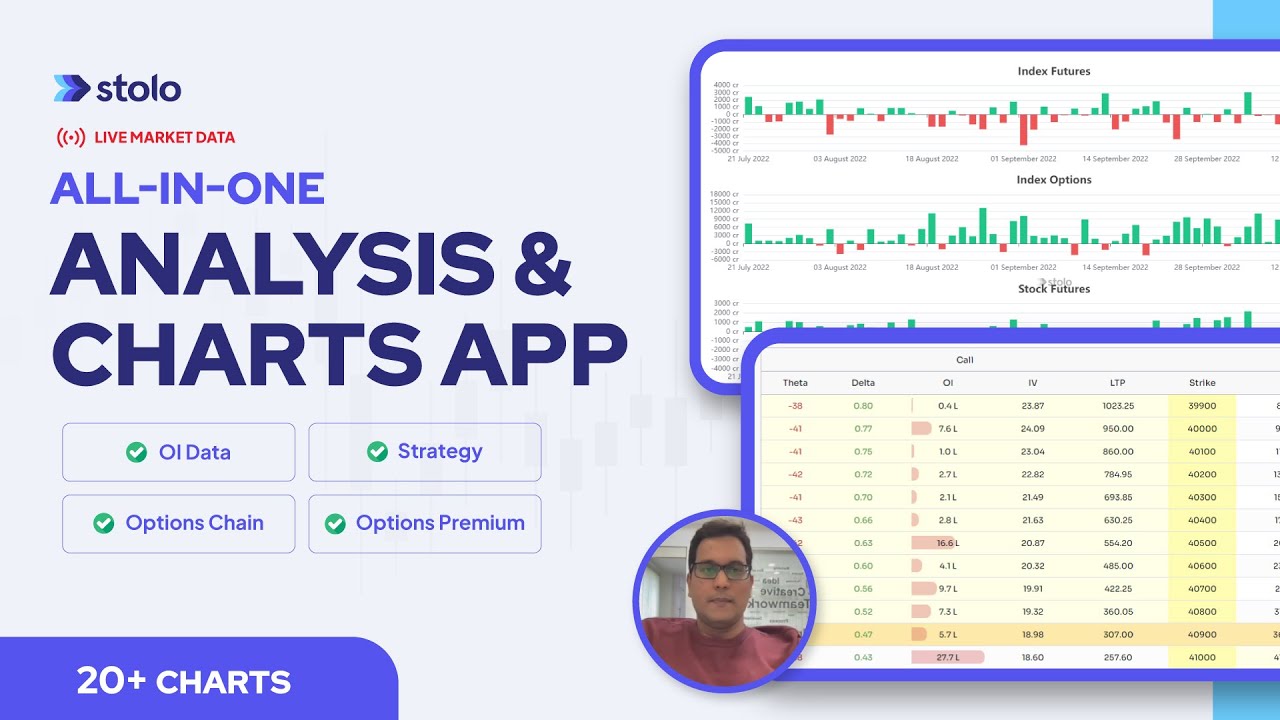
Stolo's open interest charts for market analysis cover OI change, Futures OI, PCR, Strikewise OI, Multi-Strike OI, and Cumulative OI Change, all sourced from NSE authorised real-time feeds and available for Nifty, BankNifty, FinNifty, and all 191 NSE F&O stocks in a single unified terminal.
Trader Voices
Every trade is a small bet on a dream, backed by risk and a decision you have to own. Stolo is built for traders who bring purpose and discipline to that decision, not just numbers.

My first impression of your site, "K.I.S.S."..... Simple yet effective...uncluttered and has all the ingredients a trader actually needs not the nonsensical ones... great job
These are unedited testimonials from traders in our Telegram community. Photos shown are AI-generated and used for representation only.

You have something unique in your platform that has changed my trading. I have used Quantsapp earlier didn't find it useful. I have tried opstra, sensibull etc.
These are unedited testimonials from traders in our Telegram community. Photos shown are AI-generated and used for representation only.

Dear Sir, I am really impressed with the user interface and multiple other facilities for option traders.
These are unedited testimonials from traders in our Telegram community. Photos shown are AI-generated and used for representation only.
Got a question or a feature you wish existed? Drop it in our Telegram community, the Stolo team is right there reading every message.